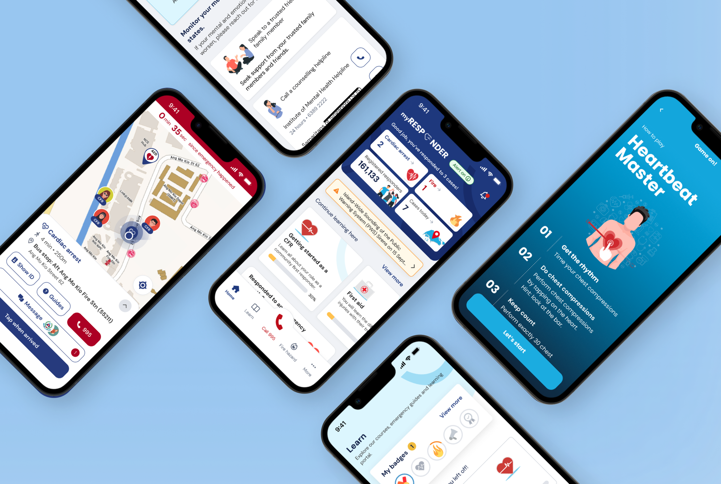
From Research to Rescue: Empowering Singaporeans to Respond to Emergencies
Role: Lead Researcher (tender) → Content Designer & Usability Testing (project)
Client: Civil Defence Sector
Project: Emergency Response App
Team: 3 Designers, Design Lead, Research Lead, Project Lead
The Challenge
When someone collapses from cardiac arrest, every minute without CPR reduces their survival rate by 10%. The SCDF's myResponder app was created to alert trained volunteers nearby—but too often, even certified responders hesitated when the notification came through.
For myResponder 2.0, we needed to solve two problems:
Between emergencies ("peace time"), how might we better prepare people?
During emergencies, how might we help them overcome the freeze response?
As the project's lead researcher, then later as content designer and usability tester, I worked to bridge that gap between knowledge and action.
Understanding the Psychology of Hesitation
I led six in-depth interviews with a mix of participants: from those who are currently or previously first-aid certified, to those who have never certified.
Our initial interviews uncovered a critical insight: knowledge alone does not guarantee confidence, and confidence is largely impacted by experience. Therefore, a first-aid certification doesn't automatically translate to increased confidence when responding in an emergency.
A 54-year-old participant with first-aid training stated:
To refine our insights, we developed a knowledge-experience matrix, with an objective statement placed in each quadrant to inform our design strategy. The y-axis indicates knowledge level (from untrained to certified), while the x-axis indicates experience level (from never responded to multiple emergencies).
Knowledgeable but no experience → Hesitant due to psychological barriers, such as self-doubt and a fear of making critical mistakes.
Low knowledge, no experience → Unaware of their role as responders.
Experienced but lacking formal training → Rare but needs guidance.
The most telling quadrant? Knowledgeable but inexperienced—people who theoretically know what to do, but might struggle to act confidently in a real crisis.
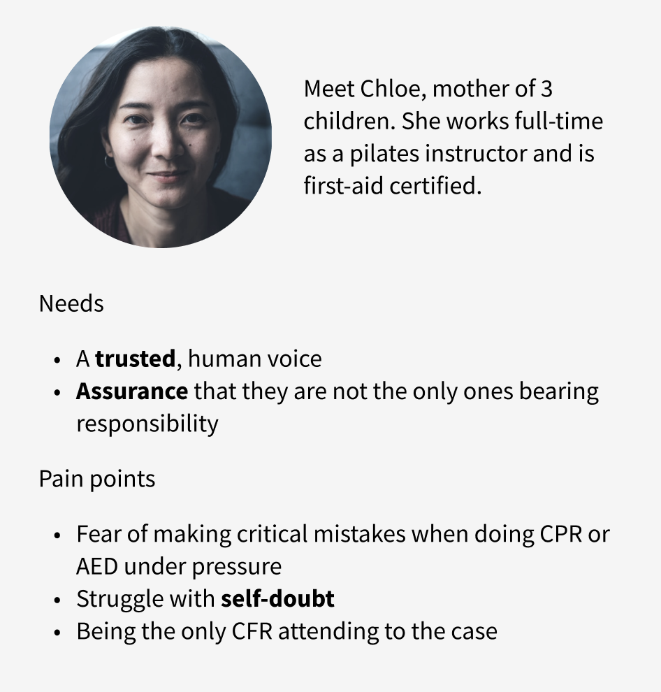
Take Chloe, our key persona. She could demonstrate perfect CPR on a dummy, but her real barriers were psychological.
This tells us that the app needed to do more than teach—it had to build emotional readiness.
Crafting a Voice That Steadies Hands
Medical apps typically fall into two extremes: sterile and impersonal (such as Drugs@FDA) or overly playful (such as Clu’). We carved out a middle ground—the “Reassuring Expert”—blending the authority of a paramedic with the empathy of a trusted coach.
Inspired by apps like Headspace, we designed content to adapt dynamically: educational yet engaging during peace time, direct yet supportive during emergencies. We baked the sweet spot tone into every interaction:
Emergency Time: Clarity Under Pressure
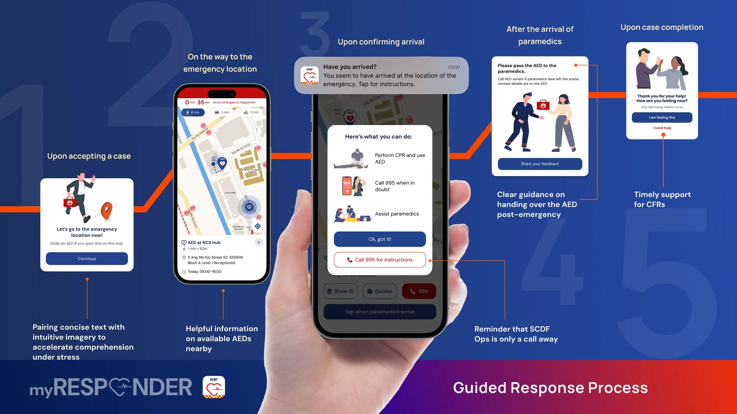
For responders like Chloe—who knew the steps but feared the pressure—we designed every interaction to reduce cognitive load while building confidence:
Step-by-step guidance:
Clear, visual instructions: Pairing concise text with intuitive imagery to accelerate comprehension under stress.
Minimalist interface: Only critical actions visible (e.g., "995", "Guides”), with secondary option “Cancel response” tucked into a menu—preserving focus while retaining user control.
Psychological safety nets:
Red ‘995’ button: Leveraging SCDF’s emergency colour coding for instant recognition, reinforcing that help is one tap away.
Post-case care: A well-being check-in ("How are you feeling now? Your well-being matters to us.") with options to access support resources, validating emotional responses.
Empathetic language:
Relational messaging: Using "You" and "We" to simulate a human connection.
Affirmation post-response: Validate Community First Responders (CFRs) contributions ("Thank you for your help!") while reinforcing SCDF’s supportive presence.
Peace Time: Building Confidence Through Guided Learning
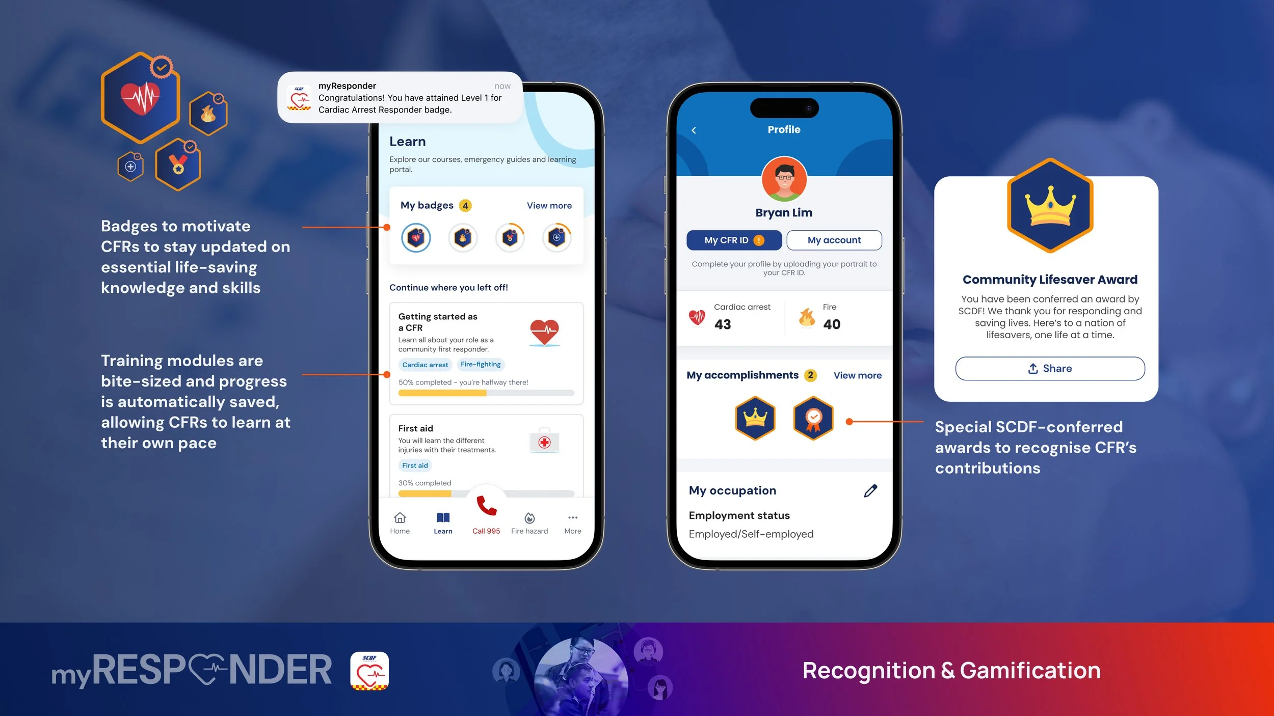
In the Learn tab, we transformed skill-building into a collaborative journey. Gamification elements—badges, progress bars, and prompts like "Let’s try” and “Let’s go”—made mastering CPR feel approachable, not daunting. But unlike trivialised "games," our design celebrated milestones with purpose:
Progress trackers: Encourage consistent skill development with motivating checkpoints ("Keep it up, you’re halfway there!")
Badges: Celebrate competency milestones with purpose-driven titles ("Fire-fighting hero")
By blending the authority of emergency expertise with the warmth of human reassurance, we crafted a voice that didn’t just guide users—it steadied them. The "reassuring expert" tone became SCDF’s silent partner in the field, transforming anxiety into action during critical moments.
Testing Designs Through a Real-Life Simulation
To evaluate how well the app supports users under real emergency pressure, we conducted usability testing in a high-stress scenario: a simulated cardiac arrest.
We blended role-play with usability testing—participants received a cardiac arrest alert and were guided through a time-sensitive rescue flow. To mimic real pressure, participants even performed CPR on mannequins.
We discovered key pain points rooted in cognitive overload: users skipped pop-ups, focused only on maps, and often ignored guidance (such as the address) or extra functions.
Their thoughts revealed tunnel vision—"How far?", "How do I get there fast?", and “I need to attend to the casualty.” These insights helped us simplify information delivery and better support users during moments of panic.
What Well-Being Checks Revealed About Motivation
For part 2 of usability testing, we tested our “peace-time” design, which yielded surprises. When we asked users to rank features based on excitement, usefulness and frequency of use, the well-being check ranked highly across all scales. Conversely, gamification features, which we assumed would drive engagement, ranked the lowest. One participant said, "Knowing that I’m being looked after by SCDF and not treated as a tool to help them... it makes me want to be an active CFR."
An example of a participant ranking features based on usefulness
View the home page findings and iterations by clicking through the slides below:
We refined the experience by reallocating gamification to where it mattered most - removing elements from the home screen and reserving badges exclusively for skill development. This allowed us to elevate more meaningful features like personalised response statistics and the well-being check, creating an experience that truly supports responders.
The Ripple Effects
1 year post-launch, the data showed subtle but meaningful shifts:
44% increase in app downloads from July 2024 to 2025
Positive app store reviews:
"This new version of the App is much better as compared to the previous. With the ability to track fellow CFRs live location when responding to cases...Overall 9.5/10” - Google App Store Review
“Works Great. Meaningful and useful app to help the community and save lives!” - Apple Store Review
Won the Singapore Good Design Award 2025 in the Digital Design category
With over 200,000 users and rising impact, myResponder fortifies Singapore's front line of emergency response, turning every alert into an opportunity to save a life.
You can download the app here.


