How I Inspired Students to Explore Their Future Through Engaging Design
Role: Prototyping, Workshop Facilitation, Desktop Research, Usability Testing
Client: Education Sector
Project: Student Career Portal
Team: 3 Designers, Design Lead, Project Lead
In Singapore, a student's career journey begins as early as age 11. But how do you inspire young minds to think about their future, when they're still focused on their next recess break? This was the challenge faced by the client’s career guidance platforms, MySkillsFuture for Students, that serves over half a million students across primary, secondary, and pre-university levels.
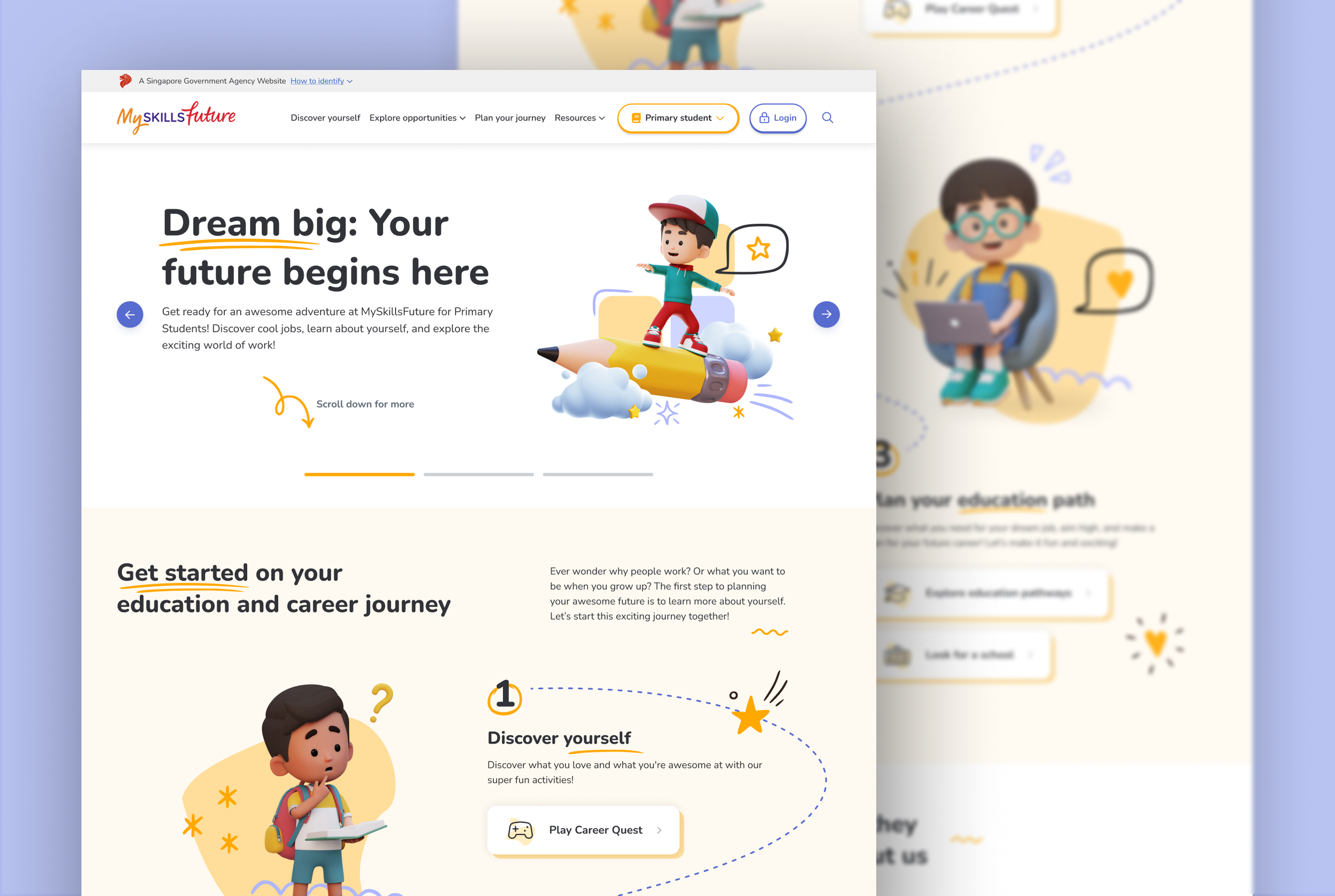
I and a team of three Designers did a redesign of three interconnected portals to transform them from mandatory school resources into engaging platforms. Through desktop research, collaborative workshops with educators, and rapid prototyping, we reimagined how young people could explore their potential careers with excitement rather than obligation.
This case study shows how we turned a government education platform into an inspiring career exploration journey that speaks to students at every stage of their development.
Where We Started
Launched in 2014, the MySkillsFuture portal was meant to help students explore their education and career options. But over time, it became clear that something wasn’t working.
At the start of the project, we spoke with teachers and Education and Career Guidance (ECG) counsellors to understand the portal’s purpose and what they hoped to achieve with the redesign. Their message was clear: the site needed to be visually engaging and encourage students to use its tools—helping them see the value of planning their future.
But one teacher’s words stood out:
This feedback wasn’t surprising. With an outdated UI and graphics that made a poor first impression, the site struggled to capture students’ interest. Additionally, the three related portals were so similar in design that first-time users couldn’t easily distinguish between them, leading to confusion.
The initial MySkillsFuture portal for Secondary Students
Analysis through Heuristics Evaluation
With limited time and budget, a heuristic evaluation provided a quick yet effective way to identify critical usability issues:
The "Success Stories" section features irrelevant videos centred on specific job roles and industries, with content inconsistently placed in unrelated sections. The storytelling felt disjointed, as some of the page’s information architecture (IA) lacked clear organisation.
Outdated and irrelevant content contradicts minimalist design principles, cluttering the interface and reducing the visibility of important information. As shown above, missing course details and events leave empty sections that add no value—a widespread issue across school, course, job detail, and event pages on all three portals.
The heuristics evaluation revealed that the portal’s UI, IA and content strategy needed significant improvements to better meet students' needs. But before diving into this, we developed proto-personas to ground the redesign in real student needs.
Building Empathy with Proto-Personas
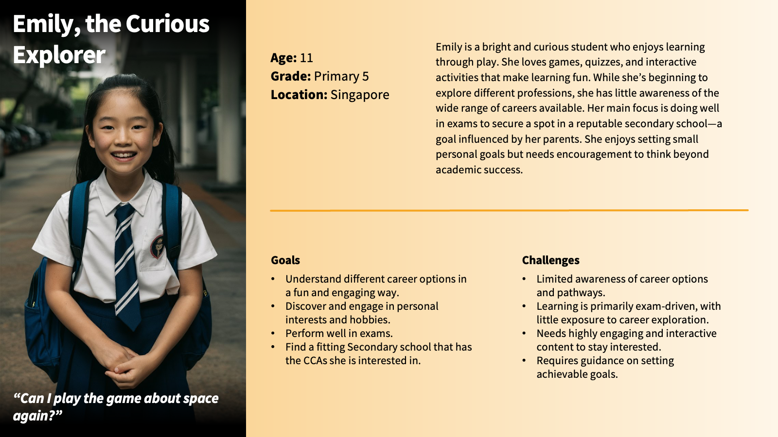
To design an effective portal, we first had to understand the unique needs of students at different stages. I developed these proto-personas based on initial research and insights from teacher interviews, creating a shared reference for the team and clients.
They represent our core users: Primary students exploring concepts, Secondary students building self-awareness, and Pre-University students preparing for higher education/workforce transitions. These personas became our essential guide, aligning every design decision on a clear understanding of who we were building for and why.
Differentiating Platforms with a UI Strategy
During the Discovery phase, we identified that the three portals looked too similar, making it hard for first-time users to know where they are. To ensure we addressed the issue while building a strong, unified identity between the three, we kept the brand’s primary colour consistent across all portal.
At the same time, we gave each portal its own personality with distinct supporting colour schemes and design elements tailored to the age group. Playful scribble graphics weave through the experience of each portal—capturing the spontaneity of doodling in class and making learning feel fun.
Card Sorting Workshop to Map Student Navigation
After developing the proto-personas and UI strategy, I collaborated with the project lead to facilitate two card sorting workshops with teachers and stakeholders: the first focused on the Primary portal and the second was on Secondary and Pre-U. Given our heuristic evaluation findings, it was crucial to align on the IA.
We began laying out a proposed navigation and content structure for each portal, then refined it with teachers. This hands-on approach allowed them to physically manipulate the site structure while keeping student needs at the centre of our discussions.
A snippet of the IA card sorting workshop for the Primary portal.
The card sorting workshops were instrumental in moving beyond our assumptions, yielding two critical insights that directly shaped the product's architecture:
The Need for a Guided User Journey: Teachers consistently structured content into a clear, linear flow: Self-discovery → Career exploration → Education planning. This insight became the foundational principle for our navigation, directly inspiring features like the guided school and course search to reduce overwhelm and provide clear direction.
Content Tailored to Student Identity: Teachers revealed that generic, one-size-fits-all content was ineffective. Students needed to see themselves in the platform. This insight drove our strategy to tailor all content to specific academic levels and reframe success stories to showcase the portal's direct role.
Reduction of Cognitive Overload: A clear need emerged to simplify the overwhelming amount of information. We streamlined the experience by renaming tools for clarity, significantly reducing redundant and duplicated content. This effort to reduce complexity made the portal more intuitive and digestible for students.
We iterated our designs based on the workshop findings and shared how we improved the IA on each page:
Through this collaborative process, we were able to propose a restructured IA that not only improved navigation but also enhanced content organisation to better serve students at different educational stages. The resulting "to-be" structure addressed key pain points identified in our proto-personas, such as needing structured guidance on education pathways, while supporting the overall goal of making the platform more engaging and intuitive for all users.
Getting Client Feedback Through a Design Critique
After iterative refinements with our Design Lead, we completed the prototypes for all three portals within a two-week sprint. To validate our direction, I facilitated a comprehensive design critique session with 10 stakeholders, combining a structured walkthrough with an interactive gallery walk where stakeholders used sticky notes to provide feedback on printed screens.
The critique revealed insights that went beyond traditional usability concerns:
Cultural Sensitivity: Characters needed to reflect school dress code standards - no flashy accessories or hoops earrings
Language Precision: Terms like "perfect match" needed to be replaced with more appropriate alternatives like "suitable alignment"
Content Organisation: Opportunities to consolidate repeated resources and streamline IA
A pivotal moment came when two Directors, joining for the first time, revealed a major shift in the national ECG curriculum—a strategic insight our team had missed. This was a critical lesson in non-linear stakeholder engagement: involving leadership earlier would have provided essential vision alignment from the start.
We acted quickly to pivot:
Realigning terminology and labels to the new curriculum framework.
Conducting focused sessions with teachers to refine the tone and content.
The result was a design that seamlessly integrated the latest national educational goals. This iteration earned unanimous approval from both leadership and educators, creating a strong, aligned foundation for usability testing.
A Glimpse of the Prototype
A short demo on selected features of the prototype
Designing for Students & the Future
This project transformed a fragmented portal into a structured, student-first experience that supports exploration and decision-making at every stage of the journey. By addressing key usability challenges and reshaping the IA and visual language, we created an experience that feels relevant, approachable, and helpful for learners across age groups.
The redesigned portal will empower students to explore education and career pathways with clarity and confidence, making the process of planning their future feel more intuitive and engaging.


